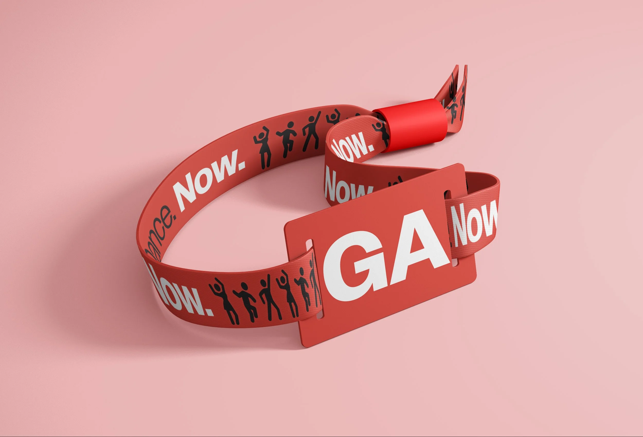
Dance Now.
In developing the style guide for ‘Dance Now,’ font selection was carefully curated to accommodate various levels of emphasis. Opting for a typeface with versatile weights allowed for bold statements when necessary, while maintaining readability for regular content. The color palette was strategically chosen to capture attention within the branding package, while also harmonizing to evoke the vibrant, energetic atmosphere of a music festival. By blending these colors seamlessly, the overall effect created a dynamic and cohesive visual identity reflective of the festival’s lively spirit.
For this project we were instructed to create a way-finding system to help support a building, event, or other spaces that needed signage. It was ultimately up to us as designer to choose a way-finding system that we could understand the movement of out guests throughout the system. I personally went with a music festival that promoted the idea of dancing throughout its branding system.